This is Worthwhile
Luminarts: Shining for young Chicago talent
Targeted to Chicago’s young talent, the Luminarts brand was born of the respected Union League Civic and Arts Foundation. It had to thrive in a digital environment and feel fresh in every capacity – a job it’s done well for years.
ASK The Luminarts Cultural Foundation wanted to create an identity and website for the non-profit that would be responsible for attracting and developing young talent and the donors that would support them. This new target was younger and more inclusive, requiring fresh thinking.
NOTE: this case study is a Fairly Painless project – we’re fans of the client, the good work they do, and the fact that the brand feels as fresh today as it did when it was developed. Credits; Chris Cook – strategy, Julie Lang – concept and design, Cheryl Bell – website design.

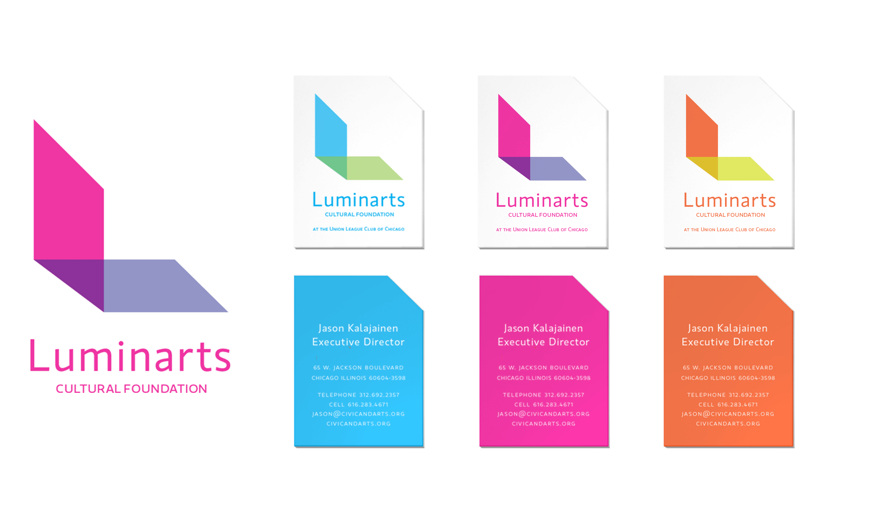
APPROACH Create a visually distinct and recognizable brand to cut through the clutter of Chicago’s cultural offerings. Make it flexible and digitally responsive, to keep it fresh and relevant to the target and the ways it would be used.
In the shape of an “L”, a graphic ribbon was developed, representing the framework the organization provides for artists, writers and musicians to succeed. The three-color palette represents the three areas of the arts.


ANSWER The website was launched, along with posters and social channels. The graphic continues to be interpreted in communications that work against our original intent of creating a distinctive and relevant cultural brand that cuts through clutter and speaks to its audience.


